
VanGo
VanGo is a public art awareness app designed for the city of Vancouver using open source databases. Contacted by Vancouver Microsoft, the team built an engaging, user-centric prototype for Android.

The Solution
Using Agile methodologies, VanGo at its core is an extremely user-centric design. Starting from scratch, I conducted background user research: observational research at public artwork sites, pop-up surveys with tourists & local Vancouverites, in-depth interviews with artist & art enthusiasts experts. This helped identify VanGo’s personas. Then I conducted brainstorm sessions to pool together our best ideas. The team applied methods like value-complexity matrices to prioritize and scope our project and affinity maps to gather and organize all of the collected data. In collaboration with the client, the team decided to organize each key feature under 3 pillars I created: ‘the city as a museum’, ‘community hotspot’ & ‘creating conversations’. During the production phase I planned, recruited, conducted & analyzed user tests for every iteration. The team applied Nir Eyal’s Hook Model to gamify the core loop, making VanGo a sticky experience. During testing I found users were highly motivated to explore Vancouver; they wanted to continue using VanGo even after I informed them that the user test was over. As strong believers of user-centered design, the team carried out extensive user research and testing every step of the way making informed design decisions.
Site Map & User Flows
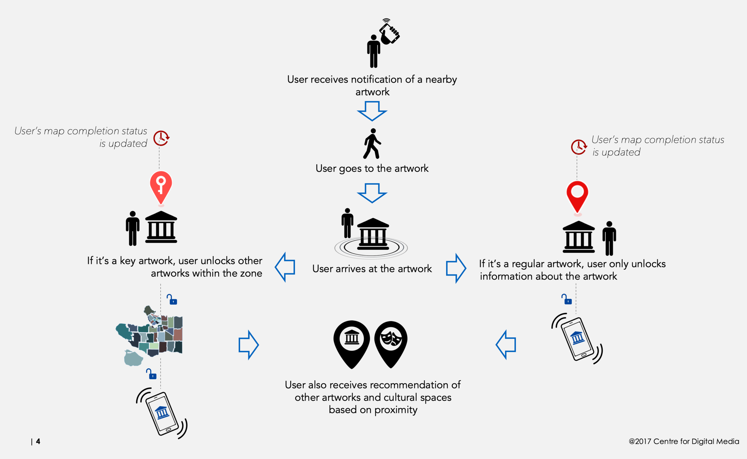
Microsoft’s main concern with this app was retention rate. Though they wanted to make a geo-location game that encouraged discovery of the city, they were unsure why and how users would open the app. Here I laid out the initial flows for 1st time and existing users. We knew that push notifications would be extremely important to direct users but only when the user was actually a block or two away from an artwork. Further, we saw that users who had opened the app were more likely to continue exploring if they knew an artwork was only a few blocks away. We wanted to capitalize on this motivation by automatically suggesting recommendations.
The City as a Museum
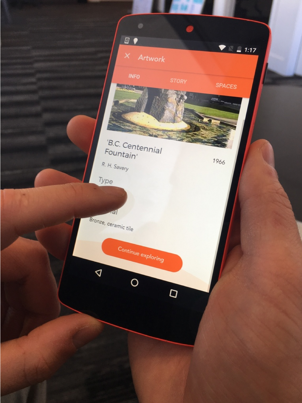
Creating the Content Strategy for VanGo was vital to legitimize the app within the arts community while also presenting pride and curiosity within the local community. Because of this, we wanted to present VanGo as a lens in which the user could see the entire city of Vancouver as a Museum. This allowed a specific format typical for presenting artistic information. Further, we decided to keep the wording simple and specific. We wanted to teach the foundation for totally new concepts in as few words as possible. As an art app it was important to let the images (photos of the public artworks & UI designs) do majority of the work. Because they were stars of the app, it was necessary to provide enough negative space allowing each image to breathe.
Research Driven Design
What kind of experience result in intuitive mechanics and high replayability while inherently teaching the user about their city via public art? VanGo is the simple answer.
By spearheading research and development, I managed to create a user-centric experience. After testing out the original prototype, I identified gaps in existing user journey and transformed the core loop according to user’s needs. VanGo needed to encourage the user explore the city via public artworks. To do this, VanGo needed a solid foundation. First, I used field research to isolate the target persona, an average Vancouverite who is interested in art but feels too intimidated or uncertain about the scene to know how to get involved. Next, I stepped into the shoes of Vancouverites to design a core loop based on the hooked model. First a user gets a notification (trigger), the user then physically walks to the artwork (action), the user automatically receives a congratulations page as well as updated information about the artwork (reward) and finally is prompted to keep exploring and discovering more artworks (investment).
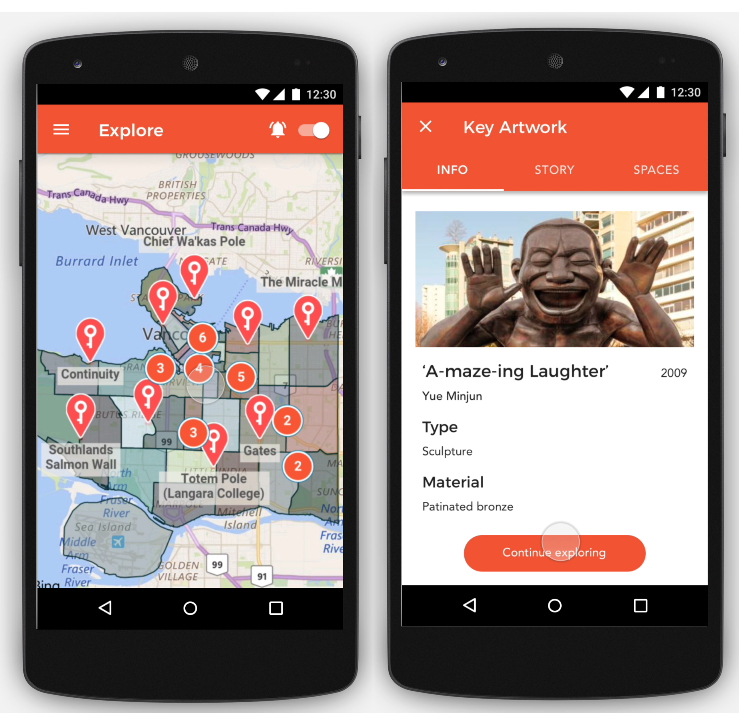
Though we designed more features, we could not implement them all without having a solid, user-centric core. I user tested each feature of the core in isolation and always provided design solutions based on the results. For example, I initially user tested a user view count within the app. Though I found users were not actually interested in the number, I did see a pattern in which some users were motivated by a low number while others were motivated by a high number. Some users wanted to be one of the first to discover an artwork while others wanted to go to the trending attractions. Taking this finding, I classified each artwork, based on view count, into a "hot spot" or "hidden gem" category.
The Map
Open data is often messy and unorganized. VanGo was lucky enough to have the integration of open data a a design challenge. I combed through Vancouver's public art database to figure out a way to present the information is a simple and cohesive manner. It is important for the user to have an uninterrupted experience. If something is missing, they will blame the app and believe it is not working. Users are harsh critiques. I needed to provide a design solution that highlighted the artwork while also accommodating for any missing information. Further, after finding the best way presentation for the user, my team provided the city of Vancouver with suggestions on home to collect their data moving forward.
Vancouver Style
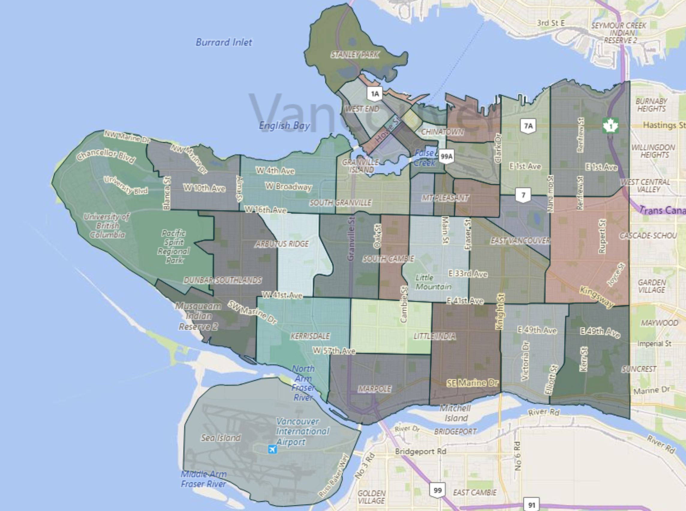
Designing a color scheme that could be associated with the city of Vancouver meant designing for city pride within locals. To break down what comprises Vancouver, we first took inspiration from nature (icy winter ocean, misty blue, forest green) as well as Vancouver's historic buildings (burnt umber, pewter grey). We then provided 40 variations to these colors and implemented them in our created zones. The result is a map with the colors of Vancouver. To off-set these dark colors, we wanted to provide a brighter tone for the main UI. We also felt a brighter color palette is more in-line with general museum design (Met, MoMa, etc), thus signifying VanGo as a legitimate art app. We took our bright UI colors from a bit of Vancouver art history: Fred Herzog. Herzog was a 60/70s photographer popular for his bright portraits of the city.